Saturday, March 9, 2013

Description


I would venture to say that there are at least one hundred different editions of Alice’s Adventures in Wonderland, and probably more. I am looking at three different editions of the novel in this blog, but I chose just one—my favorite—for the book description.

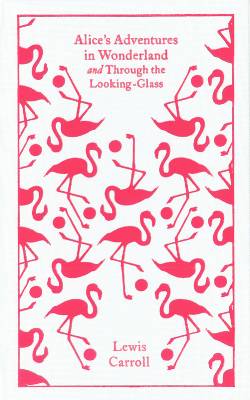
Book description: 2010. Format: Hardcover. Trimsize: 5 3/4" x 8 1/4". Pages: 160. Smooth, cloth-like binding with metallic pink stamping on front cover and spine. Fourth printing. Full color dust jacket and full color illustrations throughout by Camille RoseGarcia (1970- ), an internationally known artist whose work has been in magazines such as Rolling Stone, Juxtapoz, and Modern Painter. Semi-glossy 
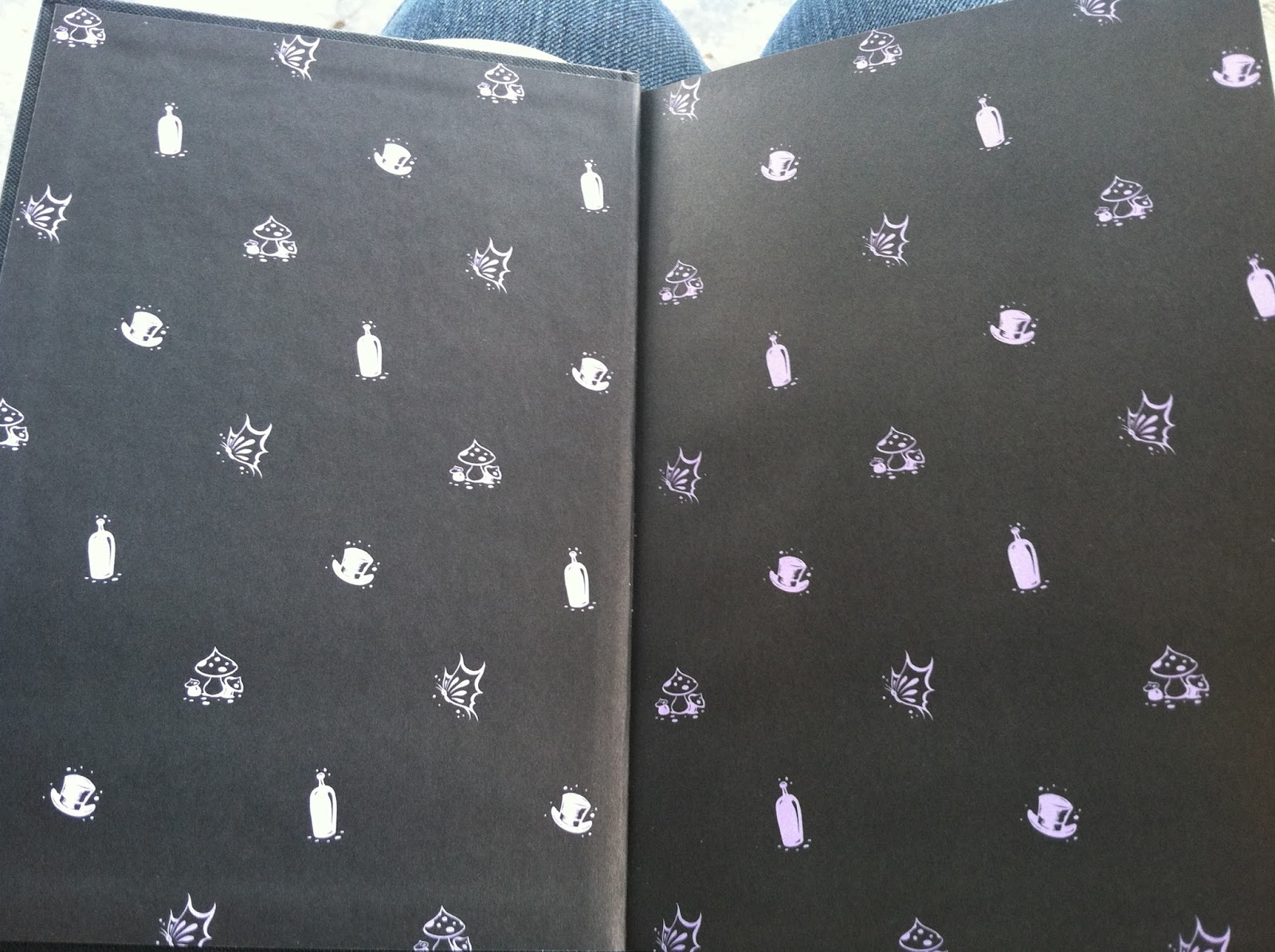
paper used to showcase Garcia’s illustrations. Black endpapers with a pattern of small lavender illustrations. Published by Collins Design, an imprint of HarperCollinsPublishers. Text first published in 1866 and written by Charles Lutwidge Dodson (1832-1898), better known as Lewis Carroll, who wrote a sequel to Alice’s Adventures in Wonderland called Throughthe Looking-Glass, and What Alice Found There in 1871. Book is in excellent condition; only one previous owner. Book designed by Agniszka Stachowicz. Printed in the United States of America. No markings, bookplates, or other notes inside covers or on pages. Printed using offset lithography and commercially bound. No headband is present, not even a decorative one.

In a Bind


The components that make up the binding of a book--namely the covers, spine, endpapers, and any decorative stamping on the cover--are often the most visually beautiful parts of a book. There is no exception when it comes to all of the editions of Alice's Adventures in Wonderland I have been looking at.


The first edition was bound in red cloth, with green-coated endpapers and gold gilt on the cover and top edge of the pages. The original copies werea bound by the James Burn and Company bindery. Some copies still exist with the original bindings, like this one and this one on AbeBooks.com. Some have been rebound using the original binding boards, endpapers, and spine. Repair work can be visible on these copies. Others have been completely rebound (this one in the 20th century) using materials similar to the originals. 


First edition


My personal copies of Alice have been commercially case bound. In the Penguin copy, the cover is a white cloth-like material stamped in dark pink. There is a fake red and white striped headband on the book, as well as a white ribbon bookmark. The endpapers are a similar pink to the stamping on the front.

Penguin Endpapers

Penguin faux headband and ribbon bookmark


In the Garcia-illustrated copy, a colorful dust jacket covers a black, more paper-like cover. It is smoother than the Penguin cover. The front and spine are stamped in a metallic pink. The black endpapers are dotted with lavender mushrooms, bottles, top hats, and butterflies. There is no faux headband on this, which I have actually never noticed before on a hardcover book. I think even a faux headband makes the books look nicer.

Garcia dust jacket

Garcia cover, sans dust jacket

Garcia endpapers

No headband


Saturday, February 23, 2013

Linocuts, or Hey! I've Done Printing Before!

I am going to change gears here a little bit, because I am sort of tired of talking about my books (sorry, books). 

While reading about woodcuts in our book, I thought, "hey! I've done this before!" (Sort of.) When I was in 8th grade, my Talented and Gifted class went to the Huntington Museum of Art for some kind of nature-y artsy day. Aside from going in the Conservatory and taking a hike and throwing bowls, we made linocuts of leaves, which was the second most fun thing I did that day (throwing bowls being the first). 

Sadly, I do not have pictures of the process, but I remember what we did very well, and I will use images from Google to supplement my recollection.

First, we were given blocks of linoleum and a v-shaped gouge tool to create the design. We were provided with several leaves for inspiration. 


Linoleum block
Gouge and blades
Examples of the marks different blades create. I think I used a blade similar to #3 here to create 
Example of print (top) and linocut block (bottom)

Next, we used a brayer to spread some ink on a pane of glass, and then used the inked brayer to coat the linoleum block. The inked block was then put through a press to transfer the image to a piece of paper. I did not get to keep my block, but I did get to keep the print.
Brayer

Coating the brayer with ink
Inking the linoleum block
A press similar to the one used to create my print
8th grade me = bad artist. Bear in mind that this was one take, and the first time I'd ever done this. I was mostly trying to not gouge a hole in my finger. Don't ask me what I was thinking with the squiggly lines around the leaf.

Check out a detailed account (with pictures) of how linocuts are made here.

Saturday, February 16, 2013

Paper


Paper is an essential part of any physical book. Papermaking did not spread to Europe until the fourteenth and fifteenth centuries. The fine paper used to make books was originally made from bleached linen rags. In the early 1800s, papermaking machines were invented. In the 1850s, it was common for paper to be made from wood pulp, though paper was still being made from rags. 

As I do not possess a physical copy of the first edition of Alice’s Adventures in Wonderland, I had to guess at what kind of paper was used to make the book. In the pictures I have of a first edition copy, the pages appear to be fairly yellowed. This is characteristic of a wood pulp paper. Wood pulp papers have a high lignin content, which contributes to high acidity, which causes yellowing of the paper and deterioration.

For the two physical copies I have, I looked at the copyright pages to see if they would yield any information about the type of paper used in the book. I had no luck with the Garcia-illustrated book, but the Penguin Classics edition had a note that it was made from Forest Stewardship Council certified paper.

The paper in my Penguin Classics edition is very smooth and off-white. It does not have the same kind of rough texture that seems standard for paper used in five-dollar paperback books. That cheap kind of paper reminds me of the manila paper my high school art teachers made us use for rough sketches. I am guessing that the paper used for this book is a higher quality paper. I think that the fact that the paper is not bright white adds character to the paper, and makes the book seem older than it really is. 

The paper used in my Camille Rose Garcia-illustrated has a bit of texture to it, but it is glossy. It proved difficult to photograph, as it kept reflecting light. You can also see the letters on the page shining if you hold the book at an angle. I learned in class that glossy paper creates brighter colors. I think the glossy paper was used to really highlight Garcia’s illustrations. Even though the illustrations have a dark quality to them, all the colors are extremely vivid.

Saturday, February 9, 2013

What is the use of a book without pictures?

I love art, so naturally I love illustrations in books. One of the things I hated the most when I was younger and started reading novels was the lack of illustration in most of the books I had to read. Sure, it’s fun to imagine scenes and characters on your own, but it’s great to be able to look at pictures of what you’re reading, even if the book contains just a few illustrations. 

The first edition Alice and the Penguin Classics edition have the same illustrations by John Tenniel. Tenniel created forty-two illustrations for Alice’s Adventures in Wonderland. Carroll gave Tenniel extremely precise instructions on how the illustrations should look. He even provided Tenniel with photographs. It is thought that Alice may be based off of Mary Hilton Badcock.

Tenniel created the illustrations by making preliminary sketches, and then adding ink and Chinese white to simulate wood engraver’s lines. He used tracing paper to transfer the designs to woodblocks. The woodblocks for the Alice illustrations were engraved by the Brothers Dalziel, the premier woodblock-engravers of Victorian England. Electrotype plates were made from the woodblock engravings, and those plates were used as the masters to print the illustrations in the books. The original plates were found in a bank vault in 1981. They are now in the British Library.

Alice meets the caterpillar. In the bottom left corner, you can see both Tenniel's initials and "DALZIEL" for the engravers.

Tenniel's Tea Party. 
Alice and the cards


Camille Rose Garcia created the illustrations in my other Alice book. Her goal with the illustrations was to reinterpret the iconic story that is Alice’s Adventures in Wonderland. She started with multiple pencil sketches, and picked the best ideas from all the sketches. The illustrations are done with watercolors and acrylics. Her illustrations are inspired by the things she collects, as is all her artwork. Her favorite scene to illustrate was the Lobster Quadrille, a scene Tenniel never illustrated for the original, because she always imagined how it would be every time she read it. 

Garcia's caterpillar
Garcia's Tea Party
The Lobster Quadrille, never illustrated by Tenniel


Click here to see all 42 of Tenniel's illustrations. 

Watch a video of Camille Rose Garcia drawing pictures for Snow White (done in a similar fashion to Alice):

Saturday, February 2, 2013

What the Font?!


I have to admit, I’m a little bit font-obsessed. Every time I have a project due, I spend at least an hour perusing the Internet for new and unique fonts. I’ve tried my hand at identifying fonts before, usually by Googling “such-and-such movie poster font” or something like that, but I didn’t have much luck Googling “Alice’s Adventures in Wonderland font”. When I did, most of the hits were along the lines of this. I was about to go with a generic talk on popular fonts in certain eras, when Erin Hensley introduced the class to a nifty site, identifont.com. With the aid of this site, I was able to find close matches to the fonts in my books.

I’ll start off with the first edition. I stumbled across this page, which happened to have some high-resolution images of a few of the pages from the first edition. Identifont thought the font used on both the title page and in the book was Monotype Modern Condensed, released in 1896—too late to be used in this book. The handy-dandy FontBook app lists a font called Monotype Old Style, which was designed in 1858 by Alexander Phemister. This seemed like a more suitable match, until I looked at it on Identifont--the Q is all wrong. So I'll go with Monotype something. Monotype Not-Corsiva. :)

Title page from Alice first edition
Text of Alice first edition

The title page of the Penguin Classics edition is eerily similar to that of the first edition, but it’s not exactly the same. It looks much more like Monotype Modern Condensed. The font in the rest of the book is different, and Identifont identified it as Bembo, released in 1929. The font in the text of the book looks way too modern to be a reasonable facsimile of the 1898 text like the title page is, so it is very possible that Bembo, or something very similar, was used.
Look familiar?
Penguin text

In the Garcia-illustrated book, the title page has the title in Garcia’s artwork, but some of the other words are in a font that is very, very familiar to me, as a Tim Burton fan. It’s called Burton’s Nightmare, and it’s based off the font used in the Nightmare Before Christmas. According to Identifont, the font used for the text of the book is EB Garamond, designed in 2010 (the same year the edition was published). I don’t know if it’s exact, but the font used in the text of the book is definitely similar. It’s definitely something Garamond. 
Garcia-illustrated title page
Check out the versals Garcia did. Love.


Next week's blog will be about illustration, which I'm excited about. :)